Sereno Café Packaging USA

Soundcheck InsightsSoundcheck Insights · Focus Group Report

Sereno Café Packaging USA

We are testing 3 options of packaging for Sereno Café in USA.

Panel size
6 personas
Concepts tested
3
Quotes collected
12
Generated
Apr 23, 2026
Executive summary

Lead with a refined Concept B as the primary packaging expression for DTC, Amazon, and specialty retail — it is the only design that earns credibility with the specialty coffee community, which is Sereno's sole defensible differentiation against Nespresso. Simultaneously develop a refined Concept A as a secondary expression for premium grocery, gifting, and hospitality channels, where the prestige segment discovers products through visual narrative rather than data. This dual-expression strategy allows Sereno to establish specialty credibility first (the non-negotiable foundation) while building a bridge to the highest-LTV consumer segment without compromising either audience.

Concept B
Concept A
Concepts tested

The creative under test

Concept

Concept A

Concept A
🔍 What the AI saw in this concept
Gemini_Generated_Image_eayxfxeayxfxeayx.png

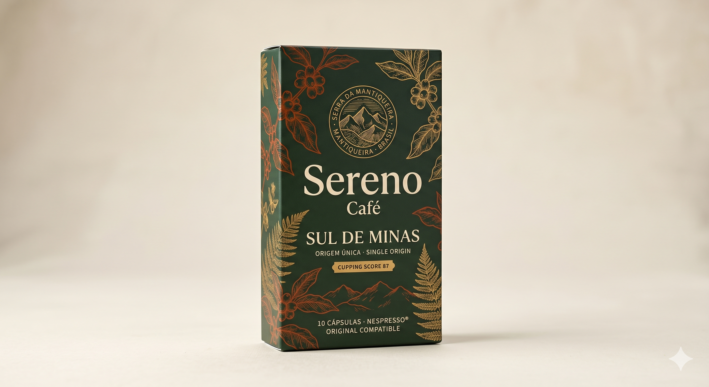
**1. OVERVIEW** A vertical rectangular cardboard box packaging mockup for coffee capsules, photographed on a warm off-white background. **2. FORMAT & COMPOSITION** The image is approximately 16:9 landscape orientation with the box occupying roughly the center-left two-thirds of the frame. The box is shown in a three-quarter perspective revealing the front face and the left narrow spine. Substantial negative space surrounds the product on all sides, particularly to the right. The front face functions as the clear focal point, with the spine carrying a continuation of the decorative botanical pattern. **3. COLORS** The dominant background of the box is a deep forest green, approximately #1E3D2F. All primary illustrative linework appears in two distinct tones: a warm terracotta-rust (approximately #A8442A) for coffee-branch and berry motifs, and a burnished antique gold (approximately #C9973A) for fern fronds, the circular logo, and secondary botanical elements. The brand name "Sereno" renders in a warm ivory-cream (#F0E8D5). "SUL DE MINAS" appears in the same antique gold. A small badge/label element behind "CUPPING SCORE 87" is rendered in the antique gold as a flat banner. The physical background of the photograph is a muted warm greige (#E8E0D5). All finishes appear matte on the box body; the gold elements carry a subtle metallic quality. **4. TYPOGRAPHY** "SERRA DA MANTIQUEIRA · MANTIQUEIRA · BRASIL" appears in a small, evenly-spaced all-caps sans-serif around the circular logo badge — tight, utilitarian, approximately 6pt relative scale. "Sereno" is set in a large, high-contrast elegant serif with moderate stroke variation and gently curved terminals — warm cream, title case, the largest text element, projecting a classical, editorial personality. "Café" sits directly below in a smaller matching serif, same cream, title case. "SUL DE MINAS" is set in a wide-tracked, bold, all-caps serif or semi-serif in antique gold — assertive and geographic in feel. "ORIGEM ÚNICA · SINGLE ORIGIN" appears in a small, lightly tracked all-caps sans-serif in gold, bilingual. "CUPPING SCORE 87" is set in a small all-caps sans-serif within the banner badge. "10 CÁPSULAS · NESPRESSO® ORIGINAL COMPATIBLE" runs in a small all-caps sans-serif at the bottom, gold-toned. **5. IMAGERY & ILLUSTRATIONS** Full-coverage engraving-style botanical line-art covers the box surface: coffee branches with cherries (terracotta), large tropical leaves (gold), fern fronds (gold), and mountain silhouettes at the lower portion. The circular central logo depicts stylized mountain peaks. All illustration work is fine-line, crosshatch-adjacent, reminiscent of 19th-century botanical or cartographic engraving. **6. LAYOUT & HIERARCHY** The eye moves first to "Sereno," then upward to the circular logo badge, then down to "SUL DE MINAS," then to the cupping-score badge, then to the botanical surroundings. **7. MATERIALS & SURFACES** Rigid folded cardboard box; matte laminate surface suggested; standard top-tuck opening implied. **8. TAGS / LABELS / CALLOUTS** A horizontal banner badge reading "CUPPING SCORE 87" centered mid-box. **9. SUBTLE DETAILS** Fine mountain-range silhouette illustration spans the lower front panel behind the capsule count text. The circular logo uses dot-separators between geographic text elements. **10. OVERALL AESTHETIC SIGNAL** Heritage botanical naturalism with South American geographic pride, rendered in an engraving-meets-luxury-goods visual language.

Concept A
Concept

Concept B

Concept B
🔍 What the AI saw in this concept
Gemini_Generated_Image_80t26y80t26y80t2.png

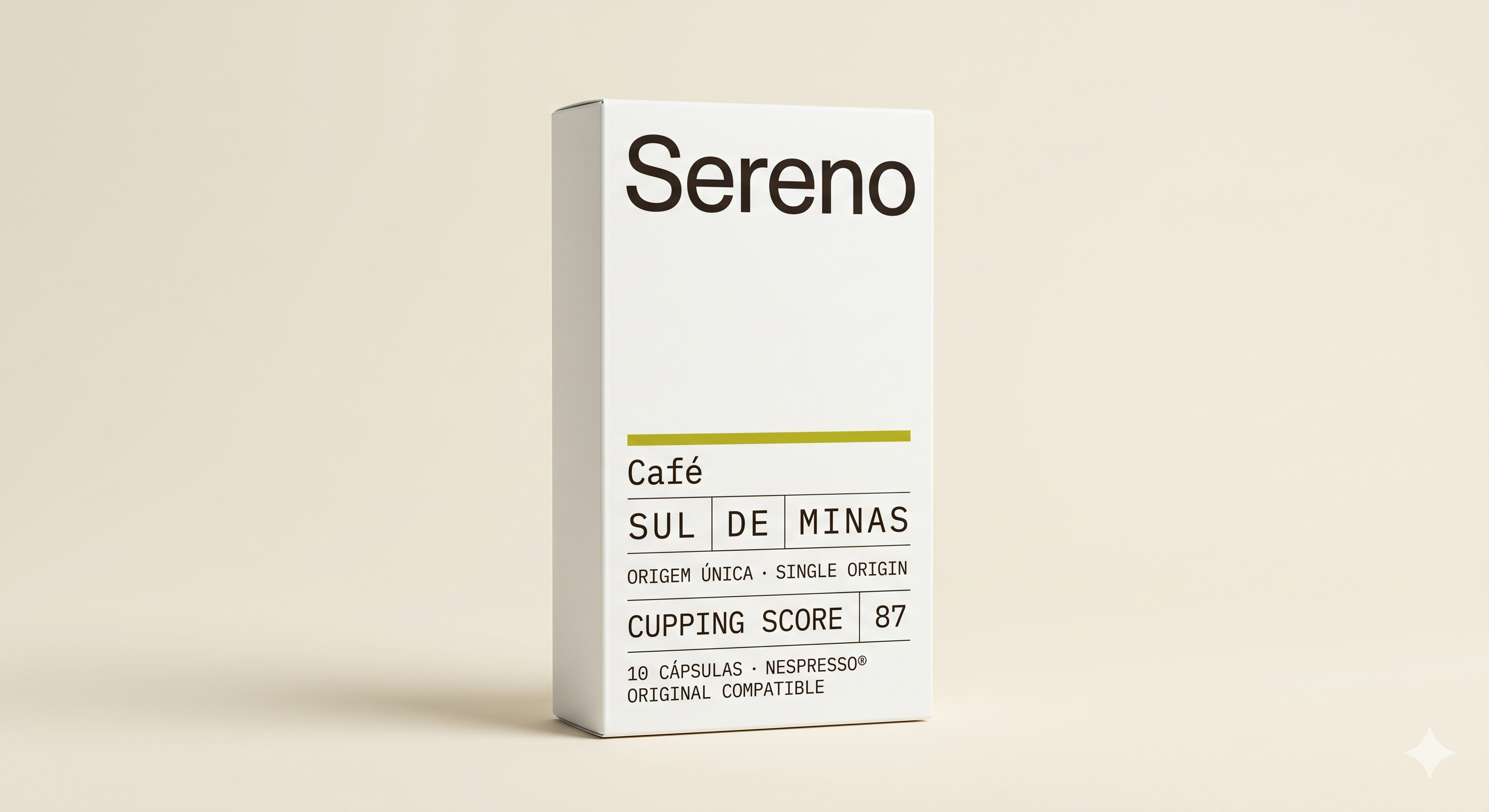
**1. OVERVIEW** A tall rectangular cardboard box packaging mockup for Nespresso-compatible coffee capsules, photographed on a warm neutral background. **2. FORMAT & COMPOSITION** Landscape orientation, approximately 3:2 aspect ratio. The box is centered-left, shot at a slight three-quarter angle revealing the front face and a narrow right side panel. The focal point is the front face typography. Generous negative space surrounds all sides; the background occupies roughly 60% of the frame. The box sits on a flat surface with a soft cast shadow beneath it. **3. COLORS** Background: warm cream/ecru, approximately #E8DFD0. Box body: near-pure white, approximately #F8F7F5, matte finish with no visible texture or gloss. Brand name text: dark espresso brown, approximately #2A1F14. All secondary text: same dark brown, slightly lighter weight. Accent rule/divider line: muted olive-yellow, approximately #8C8A1A. No gradients, metallic finishes, or embossing visible. **4. TYPOGRAPHY** "Sereno" — large, set in a rounded geometric sans-serif, regular to medium weight, mixed case, generous tracking, approximately 3× the size of any other text. Personality: approachable, softly modern, slightly humanist. "Café" — same sans-serif family, sentence case, medium weight, smaller than brand name. "SUL | DE | MINAS" — monospaced or typewriter-style sans-serif, all-caps, medium weight, contained within ruled cell borders, compact letter-spacing. Personality: utilitarian, data-forward, archival. "ORIGEM ÚNICA · SINGLE ORIGIN" — same monospaced style, all-caps, smaller, tight tracking. "CUPPING SCORE | 87" — same monospaced style, all-caps, with "87" isolated in a ruled cell. "10 CÁPSULAS · NESPRESSO® ORIGINAL COMPATIBLE" — same monospaced style, smallest text on the panel, all-caps, tight spacing. **5. IMAGERY & ILLUSTRATIONS** No photography, illustration, pattern, or iconography. A registered trademark symbol (®) follows "NESPRESSO." No logos other than implied brand name as logotype. **6. LAYOUT & HIERARCHY** Eye moves first to "Sereno" at top center, then drops to the olive horizontal rule mid-panel, then reads the tabular text block: "Café," "SUL DE MINAS," "ORIGEM ÚNICA," "CUPPING SCORE 87," and finally the fine print. The ruled cells around "SUL | DE | MINAS" and "87" create localized emphasis. Upper half is dominated by white negative space; lower half is information-dense. **7. MATERIALS & SURFACES** Matte white folded paperboard box, rectangular with straight edges and flat faces. No visible opening tab or perforations from this angle. Standard tuck-top carton silhouette implied. **8. TAGS / LABELS / CALLOUTS** No certification seals or barcodes visible. "CUPPING SCORE 87" functions as a callout within a ruled table cell. "NESPRESSO® ORIGINAL COMPATIBLE" functions as a compatibility badge within body text. **9. SUBTLE DETAILS** Thin ruled lines border the "SUL | DE | MINAS" grid and separate "CUPPING SCORE" from "87." The olive-yellow horizontal rule above "Café" is the sole color accent. Vertical dividers within the SUL|DE|MINAS cell mirror a data-table convention. **10. OVERALL AESTHETIC SIGNAL** Stark minimalist modernism with a scientific/archival typographic vocabulary, anchored by a single organic olive accent.

Concept B

Concept

Concept C

Concept C
🔍 What the AI saw in this concept
Gemini_Generated_Image_vcagu1vcagu1vcag.png

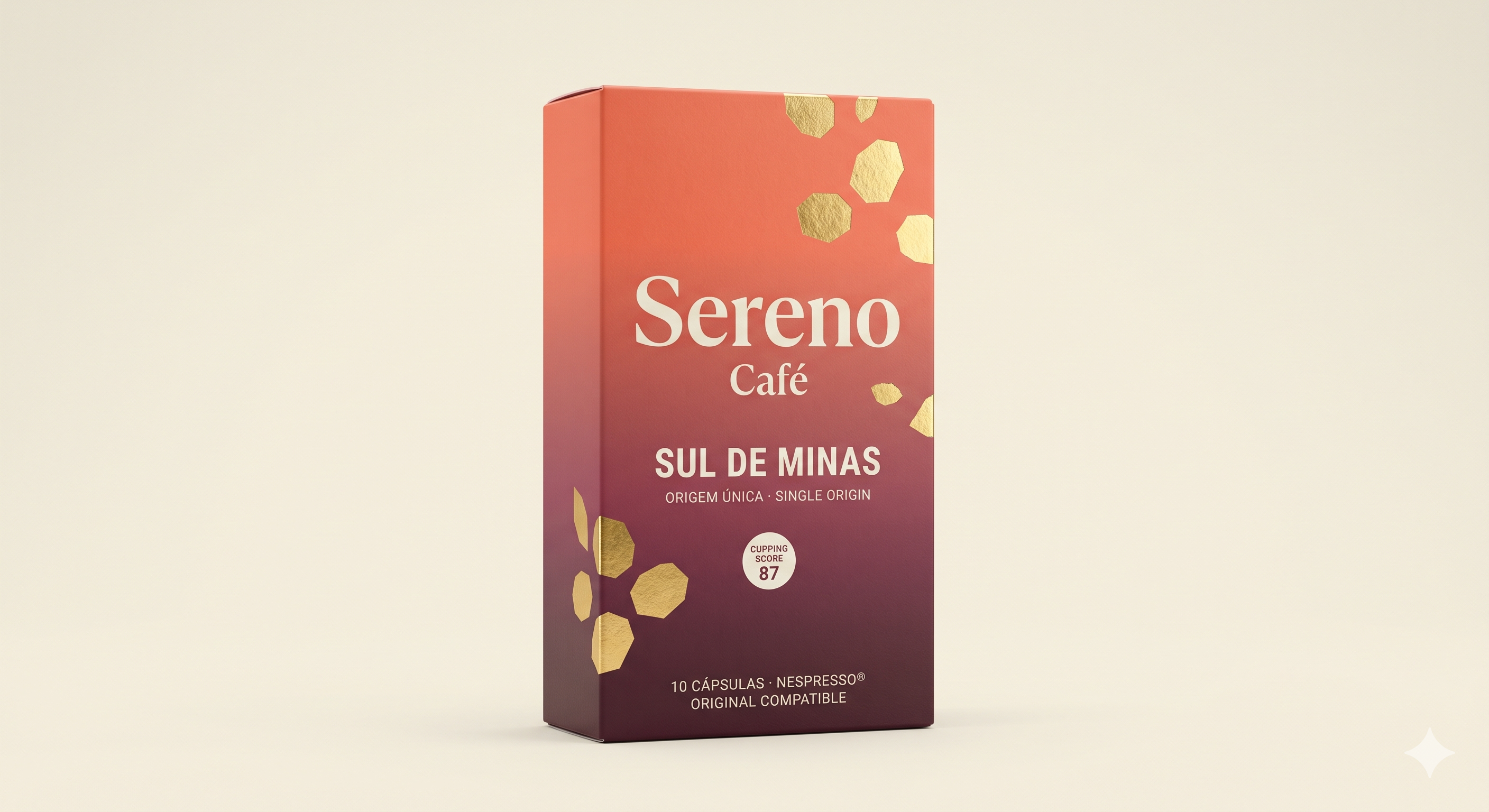
**1. OVERVIEW** A rectangular coffee capsule box packaging mockup photographed in three-quarter perspective against a light warm-beige background. **2. FORMAT & COMPOSITION** Landscape orientation, approximately 3:2 aspect ratio. The box occupies the center-left of the frame, tilted slightly to reveal the front face and left side panel. Significant negative space surrounds the product on all sides. The focal point is the front face. The box is rendered with a soft drop shadow grounding it against the background. **3. COLORS** The box features a vertical gradient running from a warm coral-red (approximately #C95A45) at the top through a mid-tone muted crimson to a deep burgundy-purple (approximately #4A1A3A) at the bottom. The brand name and primary text are rendered in warm off-white/cream (#F2EAE0). The decorative geometric shapes are metallic gold with a foil-like, reflective finish suggesting hot-stamp or foil embossment. The background is a flat warm cream (#EDE8E0). The side panel continues the same gradient. No matte or glossy distinction is overtly visible, though the box surface reads as matte with isolated metallic accent elements. **4. TYPOGRAPHY** "Sereno" appears in a large, elegant serif typeface — tall, moderately high contrast between thick and thin strokes, with gentle curves suggesting a transitional or Didone-influenced serif. Weight is regular-to-medium, casing is title case, centered, with comfortable natural tracking. It reads as refined and classical. "Café" sits directly below in the same serif, noticeably smaller, lighter weight, also centered. "SUL DE MINAS" is set in a wide-tracked, uppercase sans-serif — geometric, medium weight, modern and structured in personality — sized between "Sereno" and "Café." "ORIGEM ÚNICA · SINGLE ORIGIN" is a small, widely-spaced uppercase sans-serif, lightweight, centered beneath "SUL DE MINAS." "CUPPING SCORE 87" appears inside a circular badge: "CUPPING SCORE" in very small uppercase sans-serif, "87" in large bold sans-serif numerals. "10 CÁPSULAS · NESPRESSO® ORIGINAL COMPATIBLE" appears at the bottom in small uppercase sans-serif, centered, light weight. **5. IMAGERY & ILLUSTRATIONS** Scattered across the box are abstract geometric shapes resembling irregular hexagons or faceted mineral fragments, rendered in metallic gold foil finish. They vary in size, clustered in the upper-right and lower-left areas, suggesting an organic, asymmetric pattern. No photography. No figurative illustration. No logos beyond the brand name. **6. LAYOUT & HIERARCHY** Eye moves first to "Sereno," second to "SUL DE MINAS," third to the cupping-score badge. The brand sits in the upper vertical third; the product origin occupies the middle; the badge and fine print anchor the lower third. **7. MATERIALS & SURFACES** Rigid paperboard folding carton, matte-laminated surface implied, with metallic gold foil accent elements. **8. TAGS / LABELS / CALLOUTS** Circular cupping-score badge (87) functions as a quality callout. Nespresso® compatibility noted in fine print. **9. SUBTLE DETAILS** The gold fragments appear slightly varied in opacity, suggesting depth. A small registered trademark symbol follows "NESPRESSO®." **10. OVERALL AESTHETIC SIGNAL** Warm gradient luxury with artisanal Brazilian single-origin positioning, blending classical typography with modern geometric metallic ornamentation.

Concept C

Preference vote

Which concept wins the panel?

LeadingConcept B50%(3/6)

Voters: Caroline Aldrich · Maya Okonkwo · Tomás Herrera

Concept A33%(2/6)

Voters: David Nakamura-Chen · Richard Calloway

Concept C17%(1/6)

Voters: Sofía Reyes-Martín

Current vs. aspirational

No single concept successfully bridges both current buyers and all aspirational targets. Concept B strongly retains the primary beachhead segment (Cluster 3 — Quality-Convenience Straddlers, represented by Caroline) and attracts the data-driven aspirational upgrader (Tomás) and the specialty gatekeeper (Maya), but it actively repels the highest-LTV aspirational target (Richard, Cluster 5 — Prestige Comfort Seekers) and fails to engage the aesthetics-first aspirational upgrader (Sofía, Cluster 4). Concept A performs best with the prestige segment (Richard, David) and generates moderate interest from the aesthetics-first aspirational (Sofía), but it underperforms with the specialty-credibility personas who are critical for the brand's credibility cascade. Concept C only wins the aesthetics-first aspirational (Sofía) while alienating nearly everyone else. The core tension is that the brand's beachhead segment (Cluster 3) and its credibility-cascade segment (Cluster 6) both demand specialty-coded minimalism, while its highest-LTV aspirational segment (Cluster 5) demands heritage-coded warmth — and these two design languages are fundamentally in opposition. This suggests the brand may need a packaging system that allows different emphasis across channels (e.g., a more information-forward presentation for DTC/Amazon and a warmer, more narrative presentation for Williams-Sonoma/Whole Foods) rather than a single packaging design that tries to serve all segments.

Persona panel

6 participants

Caroline Aldrich
Caroline Aldrich
The Weekday Penitent
Current
Votes for
Concept B

Concept B speaks the visual language of the specialty roasters I already trust — minimal, data-forward, confident in its restraint. It's the only concept that makes me feel like this capsule might actually be different from everything else on the market. Concept A has the right information (cupping score, single origin) but wraps it in heritage-luxury aesthetics that create distrust. Concept C is a non-starter — it looks like the capsule brands I've already rejected.

David Nakamura-Chen
David Nakamura-Chen
The Quiet Maximalist
Current
Votes for
Concept A

Concept A has the right balance of beauty and substance — it communicates provenance and craft through visual language I associate with premium food products, without being clinical or cold. It's the concept I'd most likely pick up at Bi-Rite or Good Earth. Concept B is intellectually admirable but lacks the warmth and sensory appeal I want from a daily pleasure product. Concept C tries too hard and lands in Nespresso's territory.

Sofía Reyes-Martín
Sofía Reyes-Martín
The Taste Apprentice
Aspirational
Votes for
Concept C

Concept C is the one I'd actually buy — the warm gradient and gold foil speak my visual language, it would look beautiful in my kitchen, and it feels like an approachable upgrade rather than an intimidating specialty product. Concept A is also beautiful in a more traditional way and I'd consider it. Concept B feels too cold and technical for me — it's designed for someone who already knows about coffee.

Richard Calloway
Richard Calloway
The Earned Indulgence
Aspirational
Votes for
Concept A

Concept A speaks my language — heritage, craftsmanship, a sense of place communicated through beautiful illustration. It's the only concept I'd buy at Williams-Sonoma as a gift and also keep for myself. Concept C is pleasant but generic. Concept B looks like it was designed for someone half my age who reads coffee blogs.

Maya Okonkwo
Maya Okonkwo
The Gatekeeper
Aspirational
Votes for
Concept B

Concept B is the only design that speaks the visual language of specialty coffee. It's the only one I could imagine writing about without feeling like I'm endorsing a luxury consumer product. Concept A has some credibility through its geographic specificity but wraps it in heritage-luxury aesthetics that undermine the transparency story. Concept C is a Nespresso competitor, not a specialty coffee brand.

Tomás Herrera
Tomás Herrera
The Optimizing Explorer
Aspirational
Votes for
Concept B

Concept B is designed for how I evaluate products — data-forward, clean, no decorative noise. It's the only concept that makes me feel like the brand is confident in the coffee itself rather than in the packaging. Concept A has the right information but wraps it in a visual language that feels like it's targeting someone older and wealthier. Concept C is a luxury product, and I'm looking for an optimized product.

Reactions matrix

Every persona × every concept

Traffic-light by like/concern ratio. Positive · Mixed · Negative

PersonaConcept AConcept BConcept C
Caroline Aldrich
Caroline Aldrich
Current

It's beautiful, but it's giving me 'luxury gift basket' energy — the gold foil botanical illustrations and the deep green feel more like a premium tea brand at Williams-Sonoma than a specialty coffee I'd trust.

+ 3 4
Vote

Oh. This is the one. This looks like it was designed by someone who actually drinks specialty coffee — the restraint, the whitespace, the data-forward typography. This is the capsule box I've been waiting to see on a shelf.

+ 5 3

No. This is exactly the kind of capsule packaging I walk past — the gradient, the gold foil shapes, the warm luxury palette. It looks like a Nespresso limited edition, which is the last thing I want.

+ 2 4
David Nakamura-Chen
David Nakamura-Chen
Current
Vote

This is handsome. The botanical engravings and the deep green have a quiet authority — it reminds me of something you'd find at a good hotel or a well-curated shop in Kyoto.

+ 4 2

Interesting. Very clean, very modern. But it feels a little cold — like a design student's thesis project rather than a product I'd enjoy living with.

+ 3 4

The gradient is striking and the gold foil has presence, but it's pushing toward a register of luxury that feels performative rather than earned. It's trying to be beautiful, and I can see the effort.

+ 2 4
Sofía Reyes-Martín
Sofía Reyes-Martín
Aspirational

Ooh, this is really pretty — it looks like something from an apothecary or a fancy tea shop. I'd definitely pick it up at Erewhon just because it's gorgeous.

+ 3 3

Hmm. It's very clean but it feels kind of... cold? Like a medical product or a tech startup's packaging. I'm not sure I'd notice it on a shelf.

+ 2 5
Vote

Oh wow, I love the colors! The coral-to-burgundy gradient is gorgeous and the gold shapes are so pretty. This looks like something I'd see on a 'best pantry staples' roundup on Instagram.

+ 4 3
Richard Calloway
Richard Calloway
Aspirational
Vote

Now this is a proper coffee box. The botanical illustrations remind me of the kind of engravings you'd see in an old European natural history museum — there's real craftsmanship here.

+ 4 2

This looks like a prescription medication box. Where's the coffee? Where's the story? There's nothing here that makes me want to pick it up.

+ 1 5

The colors are attractive and it has a certain warmth, but the gold shapes feel modern in a way that doesn't quite connect with me. It's pleasant but not compelling.

+ 3 3
Maya Okonkwo
Maya Okonkwo
Aspirational

It's a well-executed heritage design, but it's doing a lot of aesthetic work to distract from the fact that this is still a capsule. The botanical engravings are beautiful — and completely irrelevant to whether the coffee inside is any good.

+ 3 4
Vote

Now this is interesting. The design is stripped of every luxury cue and what's left is just... information. That's either very brave or very naive, and I'm curious which one it is.

+ 4 4

This is a luxury capsule product. Full stop. The gradient, the gold foil, the decorative shapes — this is Nespresso with a Brazilian accent. I have nothing to say about this that I haven't already said about every other premium capsule brand.

+ 1 5
Tomás Herrera
Tomás Herrera
Aspirational

It looks premium and the botanical art is cool, but it's giving me 'expensive gift for someone's dad' vibes more than 'this is the optimized capsule I've been looking for.'

+ 3 5
Vote

Yes. This is clean, this is data-forward, this is exactly how I want a product to communicate with me. It looks like a product spec sheet made beautiful — which is literally my ideal.

+ 5 4

This looks like a fancy gift box, not like a product I'd buy for my daily espresso. The gradient and gold foil feel like they're adding cost to the packaging rather than to the coffee.

+ 2 5
Themes

What resonated, what pushed back

Likes (8)

  • Cupping score on the front of the package as a verifiable quality signal
    Caroline AldrichDavid Nakamura-ChenMaya OkonkwoTomás Herrera
  • Single-origin specificity with a named region (Sul de Minas) as a credibility foundation
    Caroline AldrichDavid Nakamura-ChenMaya OkonkwoTomás Herrera
  • Matte finish and non-glossy surfaces as a signal of considered, non-mass-market positioning
    Caroline AldrichDavid Nakamura-Chen
  • Data-forward, information-dense typography that treats the consumer as intelligent
    Caroline AldrichMaya OkonkwoTomás Herrera
  • Heritage botanical illustration as a signal of craftsmanship and provenance
    David Nakamura-ChenRichard CallowaySofía Reyes-Martín
  • Warm color palette and visual personality that invites in-store discovery and social sharing
    Sofía Reyes-Martín
  • Bilingual Portuguese/English text as an authenticity signal of genuine Brazilian origin
    David Nakamura-ChenMaya Okonkwo
  • Nespresso Original compatibility clearly stated as essential practical information
    Tomás Herrera
!

Concerns (10)

  • RefinableAbsence of producer/farm name on the front panel — 'Sul de Minas' is a region, not a provenance story
    Caroline AldrichMaya Okonkwo
  • RefinableMissing processing method, altitude, and harvest/roast date — critical data for specialty-credibility personas
    Caroline AldrichMaya OkonkwoTomás Herrera
  • RefinableCupping score of 87 is unintelligible to non-specialty consumers — creates feelings of exclusion without providing context
    Sofía Reyes-MartínRichard Calloway
  • Deal-breakerGold foil and metallic decorative elements read as 'paying for packaging, not coffee' to value-conscious and data-driven personas
    Caroline AldrichDavid Nakamura-ChenMaya OkonkwoTomás Herrera
  • RefinableHeritage-luxury aesthetic (botanical engravings, deep green/gold palette) codes as 'traditional luxury' rather than 'specialty coffee' — alienates younger and specialty-aligned consumers
    Caroline AldrichMaya OkonkwoTomás Herrera
  • Deal-breakerStark minimalism of Concept B reads as cold, clinical, and exclusionary to warmth-seeking and narrative-driven personas
    Sofía Reyes-MartínRichard CallowayDavid Nakamura-Chen
  • Deal-breakerConcept C's gradient and gold foil are visually indistinguishable from Nespresso limited editions — fails to differentiate
    Caroline AldrichDavid Nakamura-ChenMaya OkonkwoTomás Herrera
  • RefinableMonospaced/typewriter typography in Concept B codes as 'Brooklyn DTC startup' to older and prestige-oriented personas
    David Nakamura-ChenRichard Calloway
  • RefinableNo trial/sampler option communicated on packaging — price barrier for aspirational buyers at $32/box
    Sofía Reyes-MartínTomás Herrera
  • RefinableConcept A's botanical density and bilingual text create high information load on a small box surface
    David Nakamura-ChenSofía Reyes-Martín
Common ground

Elements all or nearly all personas responded positively to. Brand leverage points — keep these.

  • The cupping score on the front of the package is a universally noticed and broadly valued trust signal — even personas who didn't understand it (Sofía, Richard) did not find its presence to be a dealbreaker, while personas who did understand it (Caroline, Maya, Tomás) identified it as the single most important credibility element. It is the one feature that differentiates Sereno from every other capsule brand on shelf.
  • Single-origin specificity with a named region (Sul de Minas) was positively received across all personas as a baseline credibility claim that elevates the product above 'premium blend' positioning. Every persona who mentioned it treated it as a positive, though specialty personas wanted it to go further (to farm-level specificity).
  • Matte surface finishes were preferred over glossy or metallic finishes by every persona who commented on materiality — matte codes as 'considered' and 'specialty' while gloss codes as 'mass-market' and 'Nespresso.'
  • The brand name 'Sereno' was well-received across all concepts — no persona objected to it, and several noted the typography was clean and legible. The name itself carries a calm, confident connotation that aligns with the brand's positioning.
  • Nespresso Original compatibility clearly stated on the package was noted as essential practical information — a hygiene factor that must be present but does not need to be visually prominent.
Red flags

Strongly or universally rejected. Avoid these in any direction.

  • Metallic gold foil decorative elements (Concept C's geometric shapes, Concept A's gold botanical details to a lesser degree) triggered 'paying for packaging, not coffee' skepticism from 4 of 6 personas. Gold foil is the single strongest negative signal for the data-driven and specialty-aligned segments because it codes as luxury-brand ornamentation — the visual language of brands that substitute aesthetics for substance. Any gold elements in the final design must be used sparingly and in service of information (e.g., a subtle accent line) rather than as decoration.
  • The coral-to-burgundy gradient with gold foil (Concept C) was independently compared to Nespresso limited-edition packaging by 4 of 6 personas. This is a fatal differentiation failure — if the primary beachhead segment's first reaction is 'this looks like the brand I'm trying to leave,' the packaging is actively working against the brand strategy.
  • Monospaced/typewriter typography (Concept B) was read as 'Brooklyn DTC startup' or 'hipster' by 2 of 6 personas (David, Richard) — both high-income, older consumers who represent the highest-LTV segment. While this typography works for the specialty and data-driven segments, it carries generational and subcultural connotations that limit its appeal in prestige retail channels.
  • The absence of accessible tasting-note language on any concept was a missed opportunity flagged by Sofía ('I'd want to know what makes this coffee special in language I understand — tastes like chocolate and dried fruit would sell me more than Sul de Minas') and implicitly by Richard (who responds to sensory narrative, not technical data). Two of the four aspirational targets need flavor guidance to justify a premium price, and none of the three concepts provided it.
Participant quotes

In their own words

Concept B is the first capsule packaging I've seen that speaks my visual and informational language. It positions Sereno as a specialty coffee company that happens to offer capsules, not a capsule company that claims to be specialty. If the back panel includes processing method, altitude, and roast date, this becomes a subscription candidate.
Caroline Aldrich
Caroline Aldrich
The Weekday Penitent

Why this matters
The primary beachhead buyer articulates the exact brand positioning that would convert her from Nespresso — specialty-first identity, not capsule-first — and names the specific back-panel information that would move her from trial to subscription.

Concept C is exactly the kind of capsule packaging I walk past — the gradient, the gold foil shapes, the warm luxury palette. It looks like a Nespresso limited edition, which is the last thing I want. I'd assume the coffee inside is 'fine but anonymous,' like the illy capsules I tried once.
Caroline Aldrich
Caroline Aldrich
The Weekday Penitent

Why this matters
Demonstrates that luxury-coded packaging actively repels the quality-convenience straddler segment by triggering association with mass-market capsule brands they've already rejected.

Concept A has a quiet authority — it reminds me of something you'd find at a good hotel or a well-curated shop in Kyoto. The cupping score is present but positioned as a badge, not as the headline — this is exactly the right hierarchy for me. I want the story available but not thrust upon me.
David Nakamura-Chen
David Nakamura-Chen
The Quiet Maximalist

Why this matters
Reveals that the high-income, low-performance-of-knowledge buyer wants quality credentials subordinated to aesthetic experience — the opposite information hierarchy from the data-driven segments.

Concept B is almost too minimal for me. There's no warmth, no sense of place, no beauty — it's all information and no experience. When I think about the brands I admire — Aesop, Ridge Vineyards — they're minimal but they're also sensory. This is minimal and clinical.
David Nakamura-Chen
David Nakamura-Chen
The Quiet Maximalist

Why this matters
Exposes a critical tension: the minimalism that wins specialty-coffee credibility with Clusters 3 and 6 may alienate the highest-LTV prestige segment that discovers products through physical retail and expects packaging to create desire, not just convey data.

The monospaced typewriter font and the data-table layout on Concept B feel masculine and technical — like a spec sheet, not a kitchen product. I wouldn't photograph this for Instagram. It doesn't have visual personality. My feed is warm tones, textures, objects with character. This has none of that.
Sofía Reyes-Martín
Sofía Reyes-Martín
The Taste Apprentice

Why this matters
The aspirational upgrader segment — a critical growth target — explicitly rejects the data-forward minimalism that wins the specialty community, revealing a fundamental design tension between credibility and accessibility.

Concept C's warm gradient is exactly my aesthetic — it would look amazing on my counter next to the Graza bottle and my East Fork ceramics. This is the box I'd photograph. It makes me feel like I'm upgrading my coffee without entering a world I don't belong in.
Sofía Reyes-Martín
Sofía Reyes-Martín
The Taste Apprentice

Why this matters
Confirms that the aspirational segment evaluates packaging as a lifestyle object and identity signal first, and as a coffee-quality indicator second — the 'counter-worthy' test is a real purchase driver.

Concept B looks like a prescription medication box. Where's the coffee? Where's the story? This is exactly the 'hipster Brooklyn' aesthetic that signals 'this product is not for me.' If I gave this to a friend, they'd think I forgot to wrap it.
Richard Calloway
Richard Calloway
The Earned Indulgence

Why this matters
The highest-LTV prestige segment viscerally rejects the minimalist concept, confirming that Concept B's design language is generationally and psychographically polarizing — a strength with younger specialty buyers becomes a barrier with affluent older consumers.

Concept A's botanical illustrations remind me of the kind of engravings you'd see in an old European natural history museum. I could buy this for a friend and it would communicate 'I chose something special for you' without explanation. The price is irrelevant if the presentation is right.
Richard Calloway
Richard Calloway
The Earned Indulgence

Why this matters
Validates that Concept A's heritage-luxury aesthetic directly serves the gifting use case — a high-margin channel — and that this segment's price insensitivity is activated by packaging quality, not by coffee data.

Concept B's data-table typography reads like a cupping form or a green-coffee spec sheet. This is the visual language of the specialty industry, not the luxury industry. It tells me someone on this team actually knows coffee. If Sereno also offers whole beans with this same design language and the coffee is genuinely good, I could see myself writing about the brand.
Maya Okonkwo
Maya Okonkwo
The Gatekeeper

Why this matters
The gatekeeper influencer — whose endorsement cascades to Clusters 3 and 4 — identifies Concept B as the only design credible enough to earn editorial coverage, confirming its role as the credibility anchor even if it's not the broadest commercial play.

Concept C is Nespresso with a Brazilian accent. The gold foil, the gradient — this is exactly the kind of packaging that uses aesthetics as a substitute for substance. If someone posted this in my Discord server, the reaction would be dismissive.
Maya Okonkwo
Maya Okonkwo
The Gatekeeper

Why this matters
Warns that Concept C's luxury positioning would generate active negative word-of-mouth in the specialty community — the very audience whose credibility endorsement Sereno needs to differentiate from Nespresso.

Concept B's data-table layout is exactly how I want a product to communicate with me — it's like a product spec sheet made beautiful. If you have a quality data point, lead with it. Don't bury it in a decorative badge. This is the packaging that would make me click 'Add to Cart' after reading 50 Amazon reviews.
Tomás Herrera
Tomás Herrera
The Optimizing Explorer

Why this matters
The data-driven aspirational buyer explicitly names the information-forward design as the purchase trigger, and reveals that his conversion path runs through peer reviews — packaging earns the click, reviews close the sale.

Concept A's botanical art is cool, but it's giving me 'expensive gift for someone's dad' vibes. The gold and deep green code as 'traditional luxury' — this is the kind of packaging I associate with Williams-Sonoma, not with the brands I actually buy like Peak Design or Athletic Greens.
Tomás Herrera
Tomás Herrera
The Optimizing Explorer

Why this matters
Confirms that Concept A's heritage aesthetic, while winning with older prestige consumers, creates an age-exclusion signal for younger optimization-minded buyers — a segment critical for long-term brand growth.

Strategic insights

What this focus group revealed

Findings that couldn't have been known before the test. Each carries a confidence label so you know how much to lean on it.

The brand's beachhead segment and its credibility-cascade segment demand the exact opposite visual language from its highest-LTV aspirational segment — and no single packaging design can serve both without compromising one.

HIGH
Evidence
Caroline (Cluster 3 beachhead) and Maya (Cluster 6 gatekeeper) both strongly preferred Concept B's specialty-coded minimalism and explicitly rejected Concept A's heritage-luxury aesthetic as a negative credibility signal. Richard (Cluster 5, highest LTV) called Concept B 'a prescription medication box' and strongly preferred Concept A's botanical heritage. David (Cluster 3/5 overlap) preferred Concept A over B, citing B's lack of warmth and sensory appeal. The split is not a matter of degree — it is a fundamental opposition between two design value systems (data-forward minimalism vs. narrative-rich heritage) that cannot be reconciled on a single box face.
Implication
Sereno should seriously consider a dual-expression packaging strategy: Concept B's design language for DTC, Amazon, and specialty retail channels (where the beachhead and credibility segments discover products), and a refined version of Concept A's design language for premium grocery (Whole Foods, Erewhon), gift retail (Williams-Sonoma), and hospitality channels (boutique hotels) where the prestige segment discovers products. Both expressions should share core brand elements (the 'Sereno' logotype, the cupping score, the origin specificity) but deploy them within different aesthetic frameworks. This is not unusual in premium food — wine brands routinely have different label expressions for different tiers and channels.

The cupping score is the single most powerful trust signal across the panel — but it functions as two completely different things for two different audiences, and its presentation must be calibrated accordingly.

HIGH
Evidence
For specialty-aligned personas (Caroline, Maya, Tomás), the cupping score is a verifiable data point that enables comparison and builds credibility — they want it prominent, presented as fact, and ideally contextualized (scale, comparison to benchmarks). For non-specialty personas (Sofía, Richard), the cupping score is unintelligible and mildly exclusionary — Sofía asked 'Is 87 good? Out of what?' and Richard said it 'means nothing to me.' Yet neither non-specialty persona said the score's presence was a dealbreaker; they simply ignored it or found it mildly confusing. This asymmetry is strategically valuable: the score earns credibility with the people who matter most for word-of-mouth without actively repelling those who don't understand it, as long as it is not the dominant visual element.
Implication
Keep the cupping score on all packaging expressions, but calibrate its visual prominence by channel. On DTC/specialty packaging (Concept B direction), present it prominently in a data-forward format. On retail/prestige packaging (Concept A direction), present it as a secondary badge — present but not dominant — and consider adding a brief contextual line on the back panel ('Scored by [credentialing body], scale of 0-100; specialty grade begins at 80') to make it accessible without dumbing it down.

Cluster 4 (Aspiring Capsule Upgraders) is not a monolithic segment — it contains at least two psychographically distinct sub-segments with opposing design preferences, and a single packaging approach will only capture one.

MED
Evidence
Sofía (Cluster 4, aesthetics-driven) strongly preferred Concept C and rejected Concept B, citing its warmth, Instagram-worthiness, and approachable luxury. Tomás (Cluster 4, data-driven) strongly preferred Concept B and rejected Concept C, citing its information-forward design and his suspicion that decorative packaging means 'paying for the brand.' Both are aspirational capsule upgraders in their late 20s/early 30s, but their purchase decision frameworks are fundamentally different: Sofía evaluates products as lifestyle objects and identity signals (counter-worthy, photographable, socially shareable), while Tomás evaluates products as optimized solutions (data-verified, peer-reviewed, cost-justified). These sub-segments require different entry points into the brand.
Implication
For the aesthetics-driven Cluster 4 sub-segment (Sofía archetype), the entry point is visual discovery at Erewhon/Whole Foods and social media lifestyle content — the retail/prestige packaging expression (Concept A direction, potentially with warmer, more contemporary color palette adjustments) and Instagram lifestyle photography will be the primary conversion tools. For the data-driven Cluster 4 sub-segment (Tomás archetype), the entry point is peer validation on Reddit/YouTube and Amazon reviews — the DTC/specialty packaging expression (Concept B direction) and a sampler pack at an accessible price point ($14-16 for 5 capsules) will be the primary conversion tools. Marketing spend should be allocated to both pathways rather than forcing a single funnel.

The absence of a producer/farm name is the single most consistent credibility gap across all three concepts — and it is the specific piece of information that would convert the gatekeeper influencer (Maya) from cautious neutrality to active editorial coverage.

HIGH
Evidence
Caroline flagged the missing producer name across all three concepts: 'Sul de Minas is a region, not a farm. I need to know who grew this.' Maya was even more pointed: 'Saying your coffee is from Sul de Minas is like saying your wine is from Bordeaux. It's a start, not a story. For me to write about this, I need Fazenda-level specificity.' Both personas explicitly stated that a named producer would increase their trust and purchase likelihood. Maya specifically conditioned her willingness to write about the brand on this level of transparency. Given that Maya's editorial coverage cascades to thousands of engaged specialty consumers (her Substack, Discord, Instagram), the ROI on adding a producer name to the front panel is disproportionately high relative to the design cost.
Implication
Add the farm/producer name (e.g., 'Fazenda Sereno' or the specific producer family name) to the front panel of all packaging expressions. On the Concept B expression, it should be integrated into the data-table layout. On the Concept A expression, it can be woven into the geographic narrative. This single addition transforms the origin story from 'regional single origin' (credible but generic) to 'single estate with a named producer' (the gold standard for specialty credibility). If the brand sources from multiple farms within Sul de Minas, consider lot-specific packaging or a 'produced by [name]' line that rotates with each lot.

Concept C's luxury-gradient aesthetic does not differentiate Sereno from Nespresso — it positions Sereno as a Nespresso competitor on Nespresso's own visual terms, which is a losing strategy for a challenger brand.

HIGH
Evidence
Five of six personas (all except Sofía) independently compared Concept C to Nespresso's existing packaging or limited editions. Caroline: 'It looks like a Nespresso limited edition, which is the last thing I want.' David: 'This looks like a Nespresso limited edition or a premium capsule you'd find in a hotel minibar.' Maya: 'This is Nespresso with a Brazilian accent.' Tomás: 'I'd assume it's a premium capsule competing with Nespresso on luxury positioning rather than on coffee quality.' Richard found it 'pleasant but not compelling' — even the prestige consumer it was presumably designed for did not find it sufficiently differentiated. The one persona who loved it (Sofía) loved it for aesthetic reasons unrelated to coffee quality, and her enthusiasm would not survive a taste test that failed to deliver a perceptible upgrade from her current $0.70 Nespresso capsules.
Implication
Retire Concept C as a packaging direction. Its only viable element — the warm, approachable color palette that attracted Sofía — can be selectively incorporated into a refined Concept A expression (e.g., shifting from deep green/gold to a warmer, more contemporary palette) without carrying the gold foil, gradient, and luxury codes that triggered Nespresso comparisons from the rest of the panel. The strategic lesson is clear: Sereno's differentiation must come from specialty-coffee credibility, not from out-luxurying the incumbent luxury brand.
Refinement recommendations

What to keep, change, add

Concept
Concept B
Keep
  • Radical minimalism and generous whitespace — this is the core credibility signal for the beachhead and gatekeeper segments
  • Data-table typography with ruled cells for origin and cupping score — the 'spec sheet made beautiful' approach
  • Matte white surface with no metallic finishes or decorative elements
  • The single olive accent line as the sole color element — restraint as brand signature
  • The 'Sereno' logotype in rounded geometric sans-serif — approachable, modern, distinctive
Change
  • Introduce a subtle warmth element to prevent the 'clinical/cold' read that alienated David and Sofía — consider shifting the background from pure white to a very slight warm cream (2-3% warmer), or making the olive accent line slightly more golden-warm. The change must be imperceptible to the specialty audience while adding just enough warmth for the broader market.
  • Reconsider the monospaced/typewriter secondary font — David and Richard both read it as 'Brooklyn DTC startup.' Test a clean, modern sans-serif (e.g., a humanist sans like the primary logotype family) for the data fields that retains the information-forward layout without the typewriter connotation.
  • Increase the cupping score's contextual accessibility — add a micro-line beneath the score such as 'SCA Scale · Specialty Grade' in 5pt type that gives non-experts a framework without cluttering the design.
Add
  • +Producer/farm name on the front panel — 'Fazenda [Name]' or 'Produced by [Family Name]' integrated into the data-table layout, positioned between the region and the cupping score
  • +Processing method in the data table (e.g., 'WASHED' or 'NATURAL') — this is expected by the specialty audience and costs zero additional design real estate given the existing tabular framework
  • +A single line of accessible tasting-note language on the front or a prominent position on the back (e.g., 'Dark chocolate · Dried fruit · Clean finish') to give non-specialty consumers a flavor expectation — this was explicitly requested by Sofía and would help bridge the accessibility gap without compromising the data-forward design
Concept
Concept A
Keep
  • The engraving-style botanical illustration approach — this is the primary appeal for the prestige and heritage segments
  • The geographic narrative (Serra da Mantiqueira, mountain silhouettes) — this communicates provenance through story rather than data
  • The matte finish and forest green base color — premium without being ostentatious
  • The cupping score badge as a secondary element — present but not dominant, which is the right hierarchy for this audience
  • The bilingual Portuguese/English text as an authenticity signal
Change
  • Reduce the botanical illustration density by 20-30% — David noted it's approaching 'trying too hard' and Sofía found it slightly too traditional. Fewer, larger, more confident illustration elements would increase the sense of restraint while preserving the heritage aesthetic.
  • Shift the gold elements from antique/burnished gold toward a more muted, contemporary tone — the current gold reads as 'gift basket' to Caroline and 'traditional luxury' to Tomás. A subtler metallic or even a non-metallic warm ochre would retain the warmth while reducing the luxury-gift association.
  • Simplify the text hierarchy — reduce the number of distinct type sizes and styles on the front panel. Currently there are at least 5 distinct typographic treatments, which creates the 'high information load' David and Sofía flagged. Consolidate to 3 tiers: brand name, origin/region, and supporting details.
Add
  • +Producer/farm name integrated into the geographic narrative — e.g., 'Fazenda [Name] · Sul de Minas' — positioned as part of the origin story rather than as a data field
  • +A brief, narrative tasting note on the front or prominently on the back (e.g., 'Rich dark chocolate with notes of dried stone fruit') — this serves both the prestige segment (who respond to sensory language) and the aspirational segment (who need flavor guidance)
  • +Consider a back-panel 'story card' approach — a 2-3 sentence narrative about the producer family and the farm, written in the warm editorial tone Richard responds to ('The Teixeira family has grown coffee on this hillside for four generations'). This is the content that converts Richard from trial to loyalty.
Concept
Concept C
Keep
  • The warm color palette concept (coral/burgundy tones) as a reference for potential color-warmth adjustments to Concept A — Sofía's strong positive response to these tones is a valid data point even though the overall concept is not recommended
Change
  • Do not proceed with this concept as a standalone packaging direction. The gold foil geometric shapes, the gradient, and the overall luxury-capsule positioning were rejected by 5 of 6 personas as either indistinguishable from Nespresso or as prioritizing packaging over coffee quality.
Add

Next steps

Move forward

  1. 11. Commission a refined Concept B design incorporating the recommended changes: subtle warmth shift, humanist sans-serif for data fields (replacing monospaced), producer/farm name addition, processing method addition, and accessible tasting-note language. Produce a physical prototype for in-hand evaluation.
  2. 22. Commission a refined Concept A design with reduced illustration density, muted gold tones, simplified text hierarchy, producer name integration, and narrative tasting notes. Produce a physical prototype for in-hand evaluation.
  3. 33. Conduct a second-round validation test with real consumers from Clusters 3, 4, and 5 — presenting the refined Concept B and refined Concept A side by side, in simulated retail environments (Whole Foods shelf, Amazon product page, DTC website) to validate the dual-expression strategy with real purchase-intent data.
  4. 44. Send physical samples of the refined Concept B packaging (with coffee inside) to 3-5 specialty coffee editorial voices (Sprudge, specialty Substack writers, r/coffee moderators) for organic reaction — Maya's profile confirms that a sample with a handwritten note from the roaster is a proven trigger for editorial coverage in this community.
  5. 55. Develop a 5-capsule sampler pack at a $14-16 price point with Concept B packaging for Amazon and DTC — this was explicitly identified as the entry-point format by both aspirational upgrader personas (Sofía and Tomás) and removes the $32 commitment barrier that both flagged.
  6. 66. Design the back panel for both packaging expressions: Concept B back panel should include processing method, altitude, harvest date, producer story (2-3 sentences), and a brief cupping-score context line. Concept A back panel should lead with a 3-4 sentence producer narrative, followed by origin details and the cupping score with context. Both should include accessible tasting notes.
  7. 77. Retire Concept C. Extract the warm coral/burgundy color palette as a reference input for potential seasonal or limited-edition expressions of Concept A, but do not develop the gradient-and-gold-foil direction further.
Current vs. aspirational tension

The recommended primary concept (Concept B) strongly retains the brand's most critical current-buyer segment — Caroline, the Weekday Penitent who has literally searched for 'specialty Nespresso pods' and represents the exact consumer Sereno was built for. It also wins the gatekeeper influencer (Maya) whose editorial endorsement is the credibility catalyst for reaching Clusters 3 and 4, and the data-driven aspirational upgrader (Tomás) who represents the younger, digitally-native growth segment. However, Concept B actively repels the highest-LTV aspirational target (Richard, Cluster 5) and fails to engage the aesthetics-first aspirational upgrader (Sofía, Cluster 4 visual sub-segment). This is not a fatal flaw — it is a sequencing question. Sereno's launch strategy should prioritize credibility establishment with the specialty community (Clusters 3 and 6) before expanding to the prestige segment (Cluster 5), because specialty credibility is the brand's only defensible differentiation against Nespresso. A refined Concept A expression, introduced 6-12 months post-launch for premium retail and gifting channels, can capture the prestige segment once the brand's specialty bona fides are established. Attempting to win both segments simultaneously with a single design would result in a compromised middle ground that fully satisfies neither — the classic 'stuck in the middle' positioning trap. The recommended dual-expression strategy (Concept B for DTC/specialty/Amazon, refined Concept A for premium retail/gifting/hospitality) allows Sereno to sequence its segment capture without sacrificing credibility at either end.